

“This is the world in 2050! This map shows the extent of the changes where you live”
Visualize how your environment will evolve over the next 30 years. It is possible to zoom in a very advanced way on a region, a department, a city and even a district on this map which presents the world in … 2050!
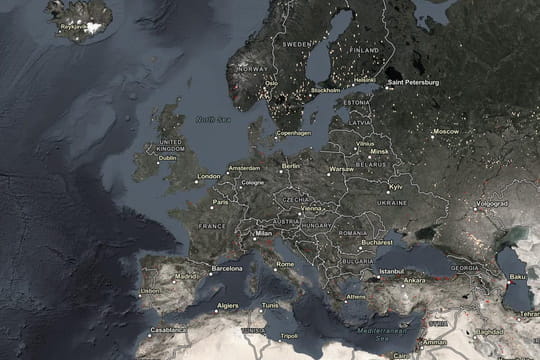
A very interesting interactive map has been created. published on the Internet, illustrating à what our planet will look like in 2050. It notably includes fascinating details about France, which will also undergo big changes. The creators of this world map developed it from scratch. start from forecasts based on existing data regarding the coverage of different terrains and the speed of ongoing changes. The project was carried out carried out in collaboration with researchers from the Universityé American company Clark, based in Massachusetts.
Thanks to this à the analysis of numerous models, they succeeded in achieving this goal. estimate how the Earth's surface will change by 2050. The interesting thing is that it is possible to zoom in very well. you have progressed in a region, a department, a city and even a district. You can therefore visualize how your environment in the next 30 years.
If you are interested in by the vision of the future of our planet, this interactive map is available on this website. The graphics are clear, and the menu is very easy to use. to use. With a vertical slider, you can quickly compare the Earth's coverage in 2018 (the creators based their work on this data) with the forecast for 2050 Although it may seem like only a few decades, we can clearly see that areas like forests or agricultural land will change considerably.
The key element to understand the map is the coloring. Here's what the different colors mean:
- Pink – predominantly agricultural areas
- Yellow – pastures, lawns and bushes
- Light green – areas mainly covered in forests & deciduous leaves
- Dark green – coniferous and coniferous forests evergreen leaves
- Grey-white – areas where vegetation is rare
- Beige – areas without vegetation
- Mint Green – often flooded or marshy areas
- Red – urbanized areas or with artificial surfaces.
Changes can be observed in many regions. Thanks to à This map allows everyone to examine their own region. A look at the coasts, for example, shows that there will be a radical change in the proportion of green areas. If predictions come true, by 2050 more agricultural land will replace these areas. Such changes await many regions across the world. worldwide. The most affected areas will be those that have been damaged. least disturbed by man until present. They will not only feel the consequences of climate change, but also the changes associated with it. population growth and the development of agriculture and technology, which will require new locations.
The map's creators say that “understanding how our world has changed” up to 'à present can give us a vision of building a more sustainable and prosperous future.